Sebas: A Streamer Reborn

The Client
Sebas, also known as S4Sebas, is an up-and-coming streamer who is making a mark on Twitch with his chaotic personality. Focusing on horror and first person shooter genres, his rough and unpredictable nature keeps his viewers on the edge of their seats. These qualities establish Sebas’s streams as a breath of fresh air in the gaming community. Looking for a fresh start towards the middle of 2023, the now Sebas renamed himself. He reached out to me to develop the visual elements of his rebrand, including a complete overhaul of his stream design.
Project Goals
Stronger Connection
Sebas felt disconnected from his previous branding. I worked diligently to realign his branding with his core values, showcasing his personality in a fresh new way.
Expandable Design
As a developing streamer, Sebas will likely change his overlays and widgets over time. This new system needed to be expandable.
Multi-Purpose
Modularity was a large focus of this project. To help provide a cohesive visual experience, many of the new elements were designed to be functional in more than one instance.
The Challenge
During the design process, one of the major challenges we faced was his name. During our early calls, it was uncertain whether Sebas would choose “Sebas” or “S4Sebas” as his name. To assist him in visualizing the names and making a final decision, many of the early concepts included both name variations.
The results
Sebas’s new identity connects him to his brand in a way that he’s never experienced before, highlighting his personality and bridging the gap to his audience.
Moodboard
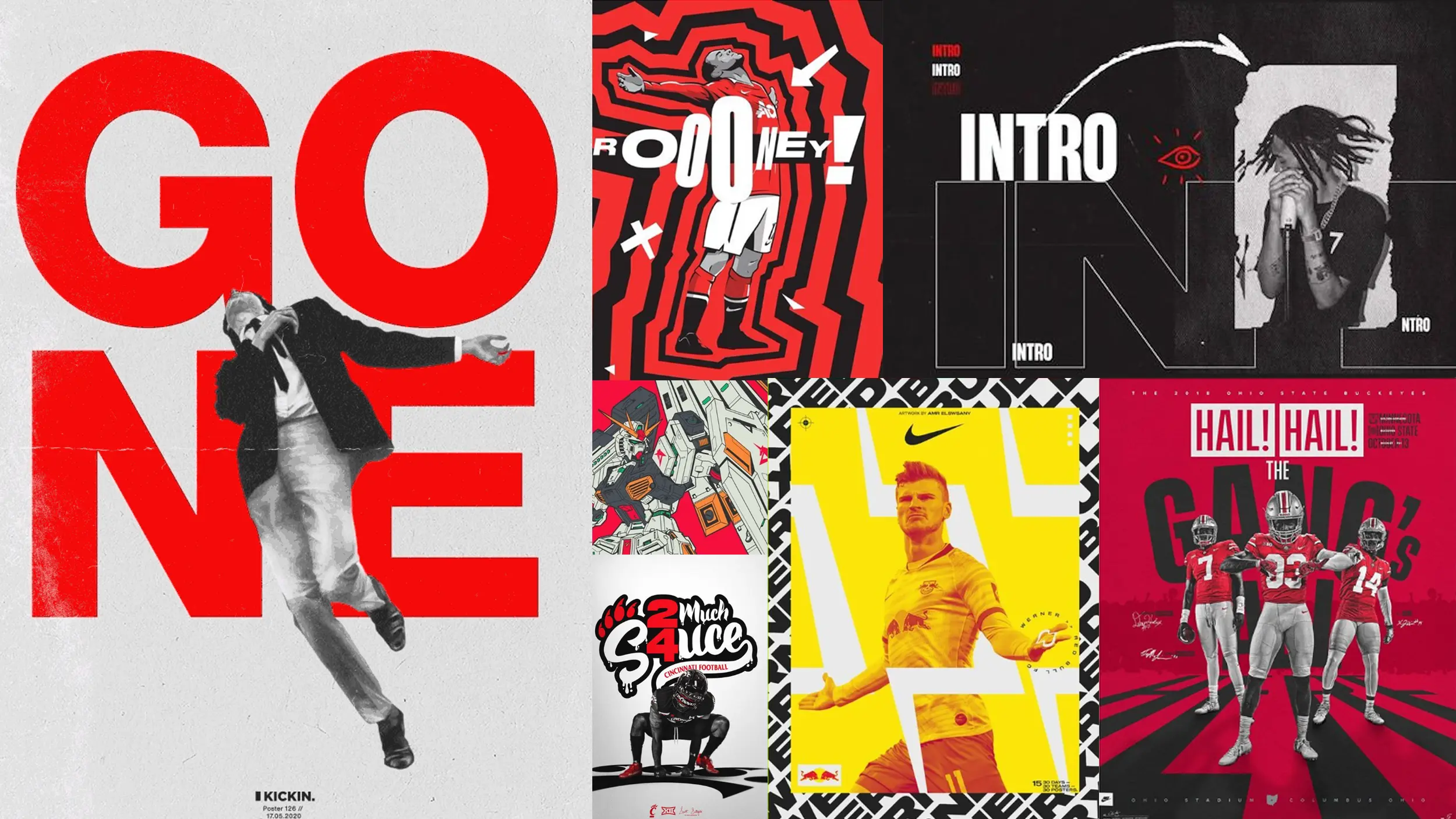
The primary focus during the mood board process was strong usage of vibrant colors and texture.
Logo System
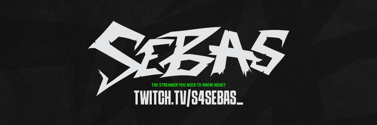
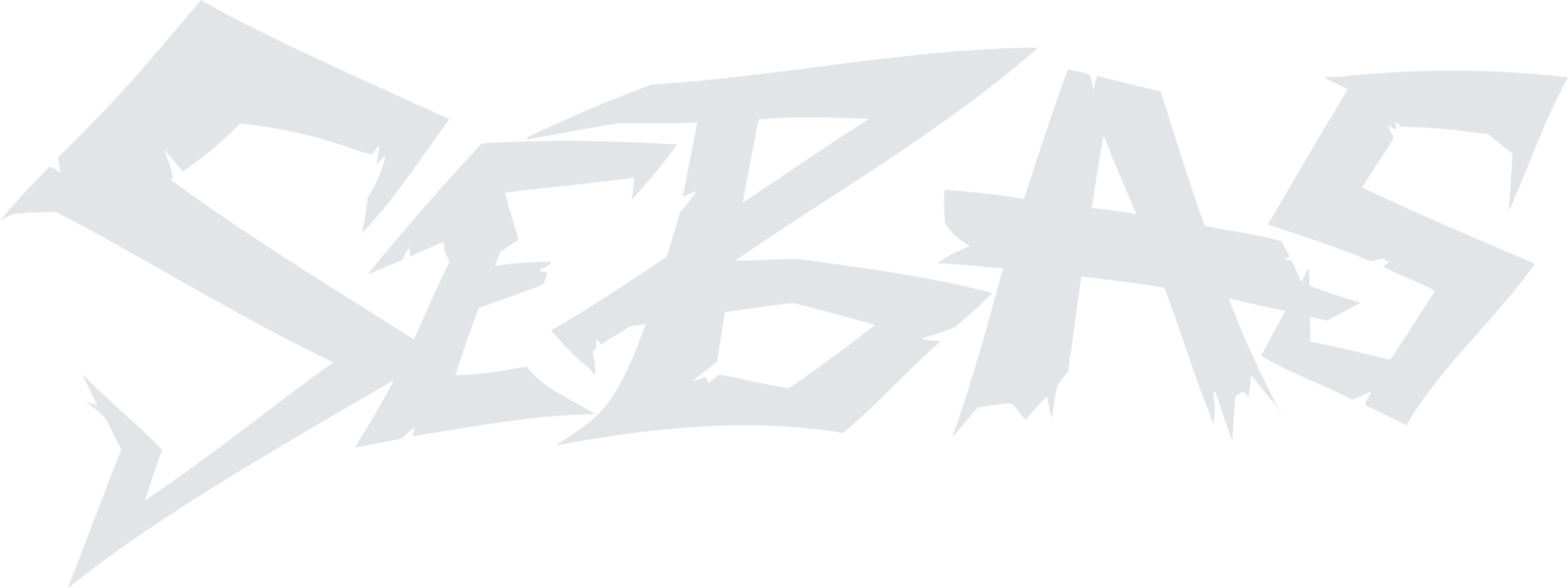
The final logo solution leans heavily into Sebas’s rugged nature with an abundance of chips and sharp corners. This hand-crafted wordmark compliments both his personality and the genres of games that he most frequently streams.
Typography
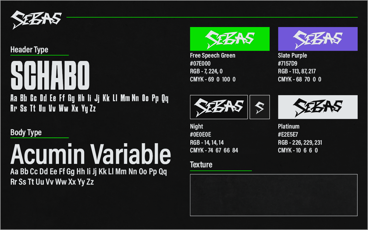
This system utilizes Schabo Condensed as it’s header type; a powerful, weighted sans serif that commands attention. It is complimented by Acumin Variable, a balanced sans serif type family.
Color Palette
Free Speech Green is the updated primary color we used to show off his loud personality. Although reds and yellows are typically used to portray high energy, they are also frequently chosen colors by streamers. Using a different color will help him stand out from other creators when users are browsing.
Slate Purple serves as his secondary color. It was important to choose another vibrant color that complimented his green for a stronger connection to the feeling of high energy.
Patterns & Texture
To break up the flat colors, Sebas’s visual elements utilize a textured image as a base. This element may be animated depending on the use case.
stream DESIGN
Sebas’s new overlays are loud in all the right places. Due to the fast-paced nature of his most frequent game categories, any motion within the overlays is kept minimal. This decision was made to avoid distracting the viewers from the gameplay itself. We combined animations of both 6 and 60 frames per second (fps) to create a unique visual experience. The jittery nature of 6 fps animation was perfect for headers and backgrounds, reinforcing Sebas’s energetic and unpredictable content style. Any other elements were animated at 60 fps to retain their subtlety. By strategically blending these frame rates the new stream design is more dynamic than ever, capturing the viewers’ attention when needed while also avoiding distraction during active scenes.
Stream Scenes
Starting Soon
When the stream begins, this is the initial screen that viewers encounter. The large panel on the right side is designated for his chat, emphasizing the importance of conversation.
Conversely, the left side of the scene is mostly transparent. This decision allows Sebas to decide what is displayed, such as artwork, a compilation, a channel trailer, or another webcam. The stripes adjacent to the main header occasionally animate to redirect the audience’s focus back to the bottom left corner.
Webcam Overlay
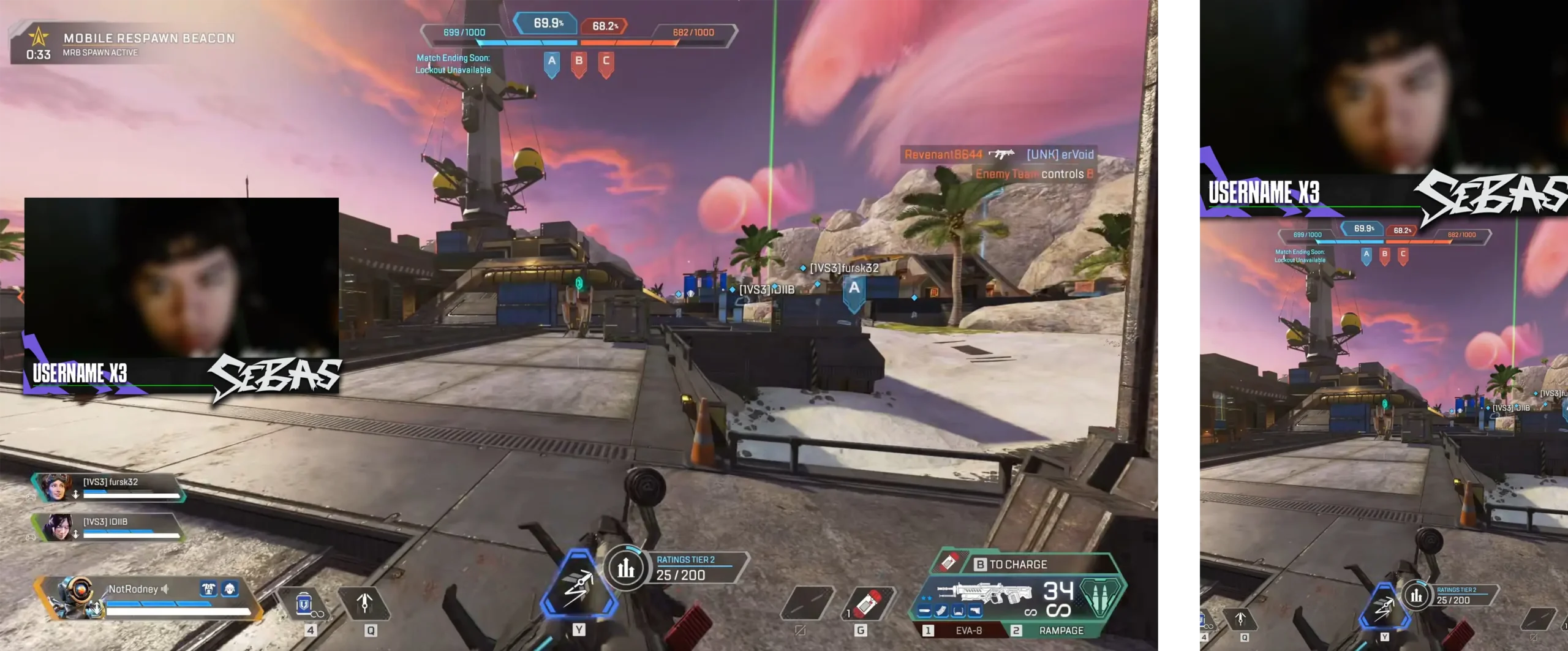
After reviewing Sebas’s social media accounts, I noticed that there is a visual difference between his content on Twitch and TikTok. Unlike the standard full-frame webcam border, this minimal approach reduces visual clutter on-screen and works well in vertical aspect ratios. The design features Sebas’s memorable wordmark as well as a space to display important information such as recent follows, donations, or gifted subs.
Horizontal vs Vertical Canvas
Stinger Transition
Sebas’s transition capitalizes on the use of 6 fps animation to stay true to his design scheme. To start, his signature wordmarks jitters in the center of the canvas before the background cuts in, covering the entire canvas. This allows the scenes to swap before the background and wordmark make their exit.
Alerts
These alerts are shown on the screen to celebrate specific actions, such as gaining new followers, subscribers, receiving gifts, or raids. These animations incorporate the style of the overlays and transition to capture the viewers’ attention without causing prolonged distraction.
Profile Art
To help strengthen his branding, Sebas was also provide with a set of profile picture, social media banners and twitch panels.
