scorpio: Silence the noise
The Client
Scorpio is more than just an energy drink. It’s a fuel for the focused mind and the dedicated spirit. They believe that true success isn’t decided by fleeting bursts of energy, but through consistent dedication.
Their mission is to empower individuals to conquer their goals, whether it’s crushing their opponents, dominating a competition, or simply navigating a demanding lifestyle. In a world of distractions, Scorpio is your key to unleashing your highest potential.
Project Goals
Create Brand Recognition
As a new brand in the market, Scorpio currently lacks any brand recognition among consumers. They need a visual identity that is both attention-grabbing and memorable.
improve brand perception
Although there was some sense of a brand understanding within the company, It was up to me to design solutions that established a stronger sense of trust and quality
Expand market reach
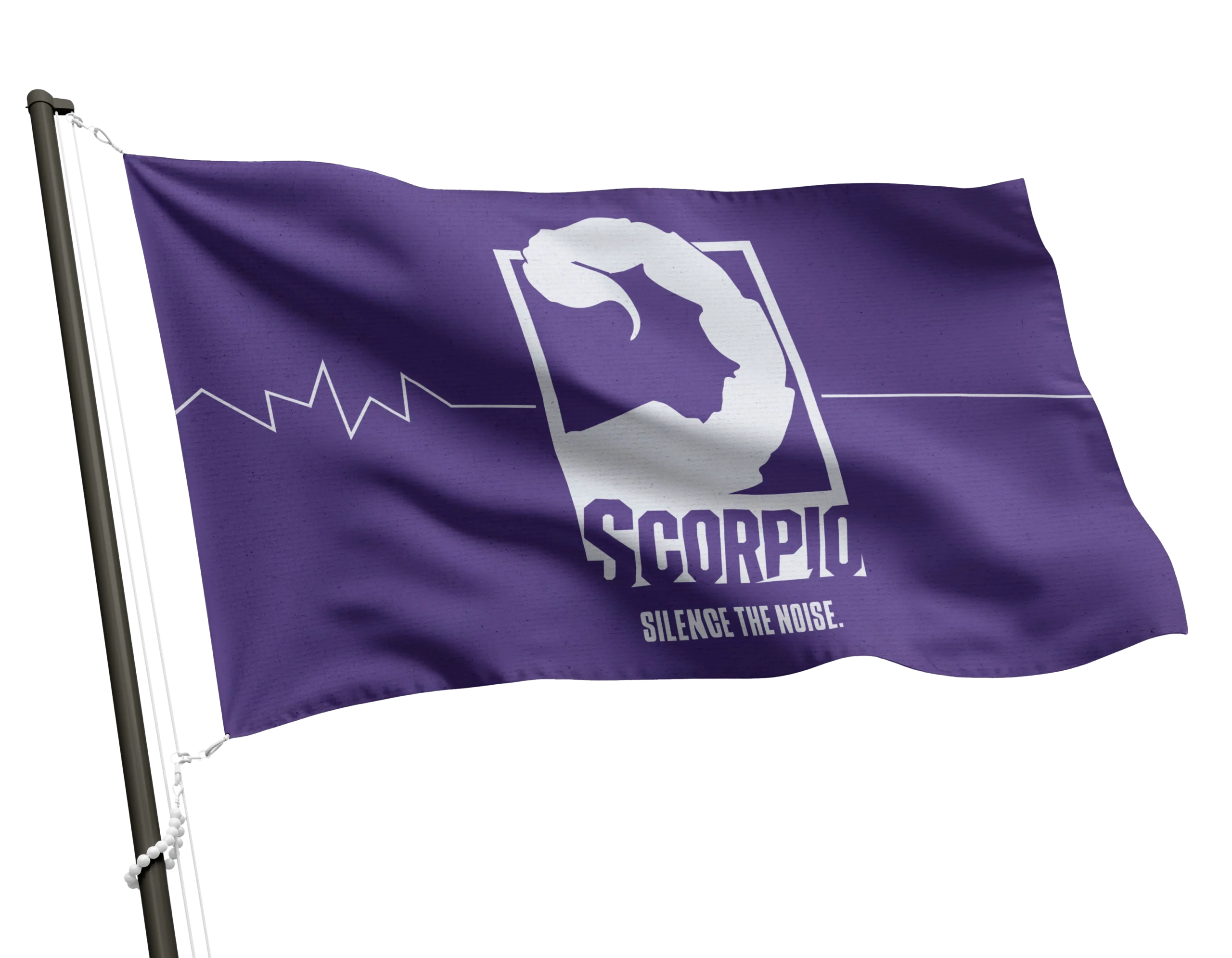
Scorpio wanted to expand their reach to include gamers and younger consumers. The new visual identity focuses on a minimalist aggression, attracting younger buyers without comprising their older fanbase.
The Challenge
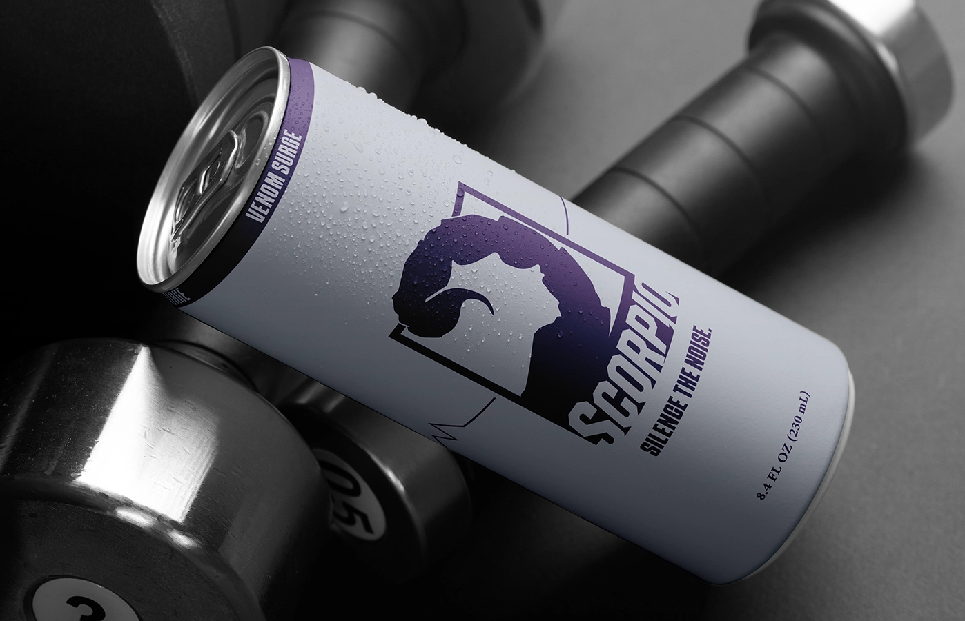
As a new contender in the energy drink market, Scorpio faced the challenge of carving out a presence in the already competitive space. With numerous options available to consumers, the brand needed to have a sense of familiarity to be able to compete with the giants. It needed to feel real.
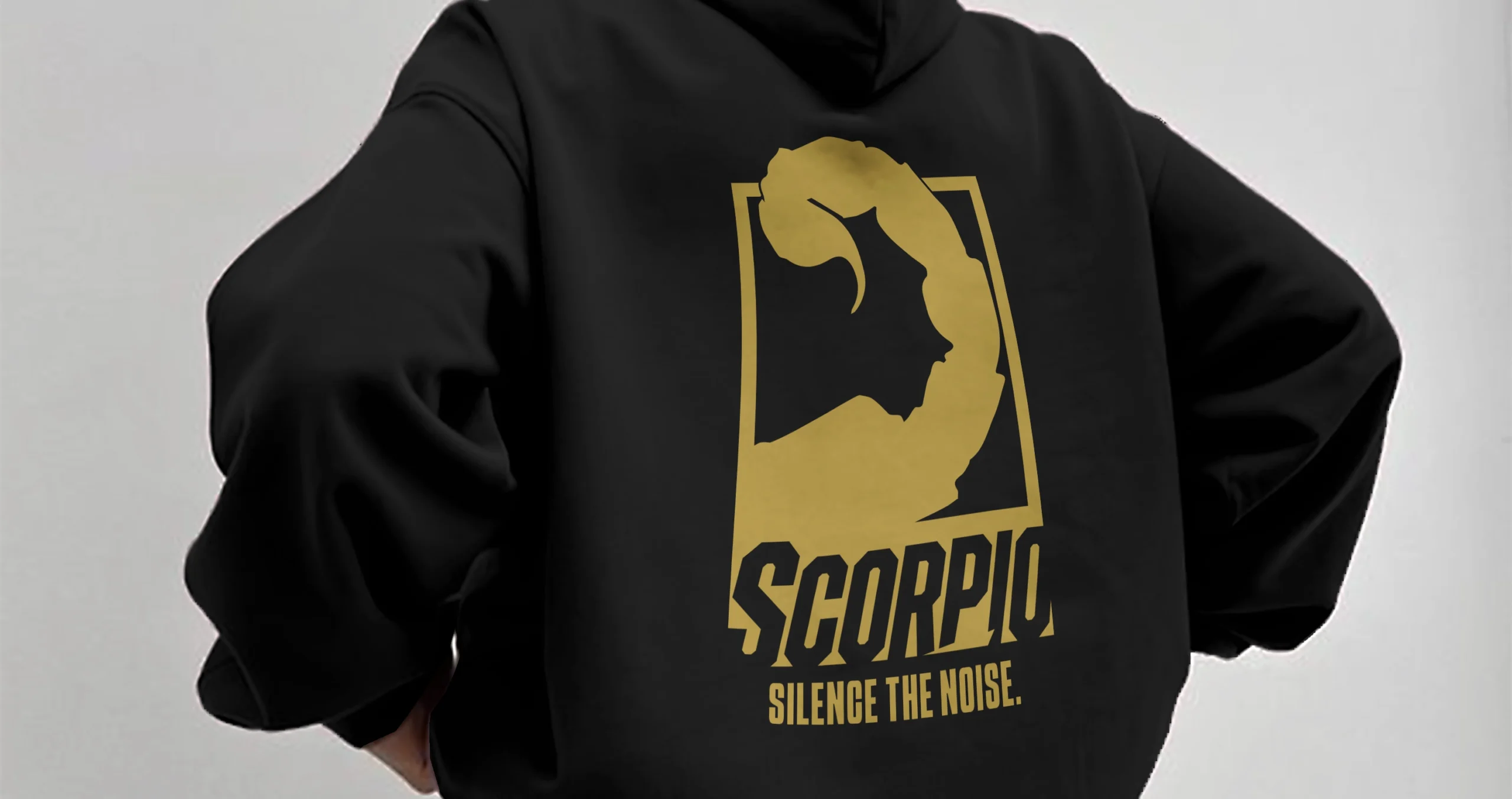
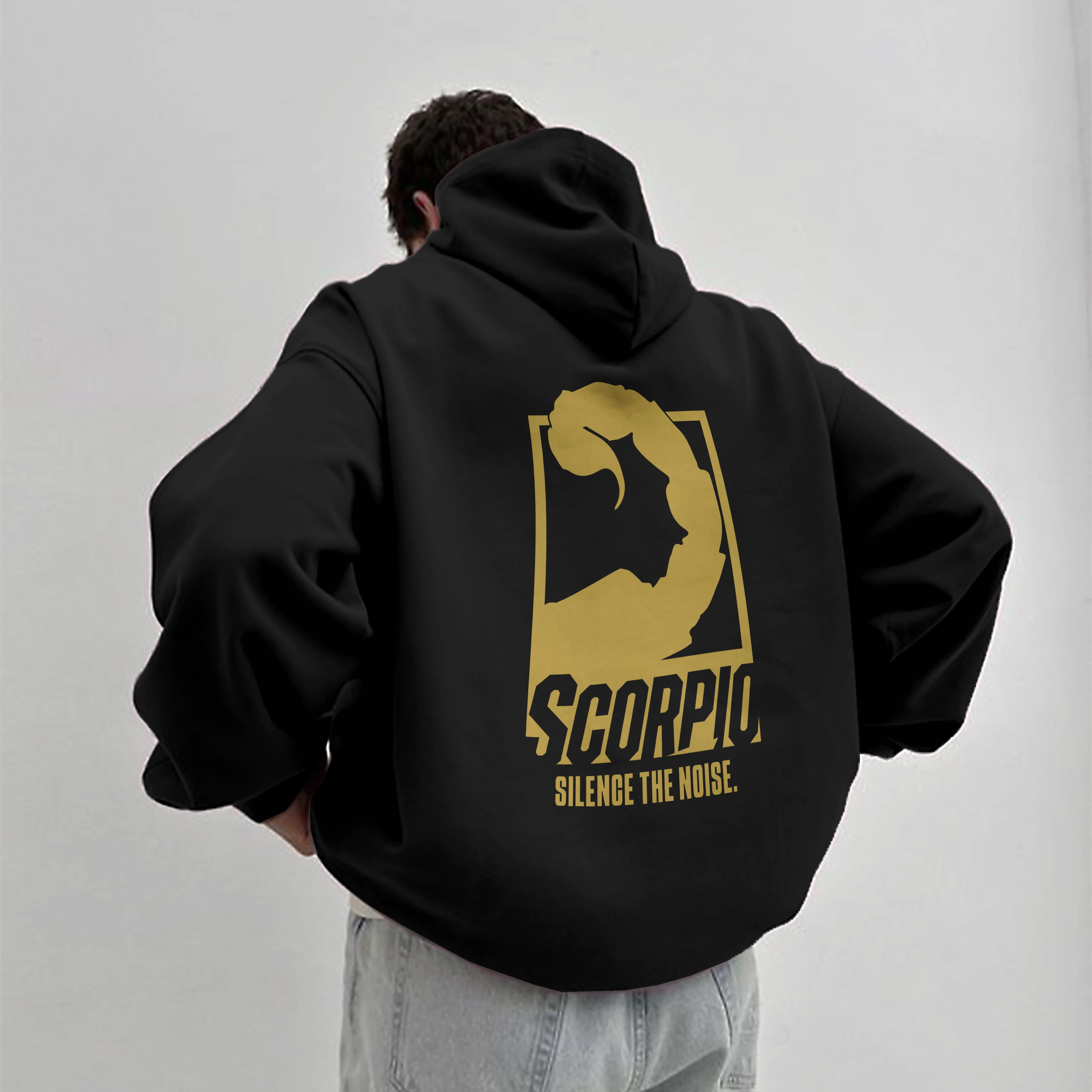
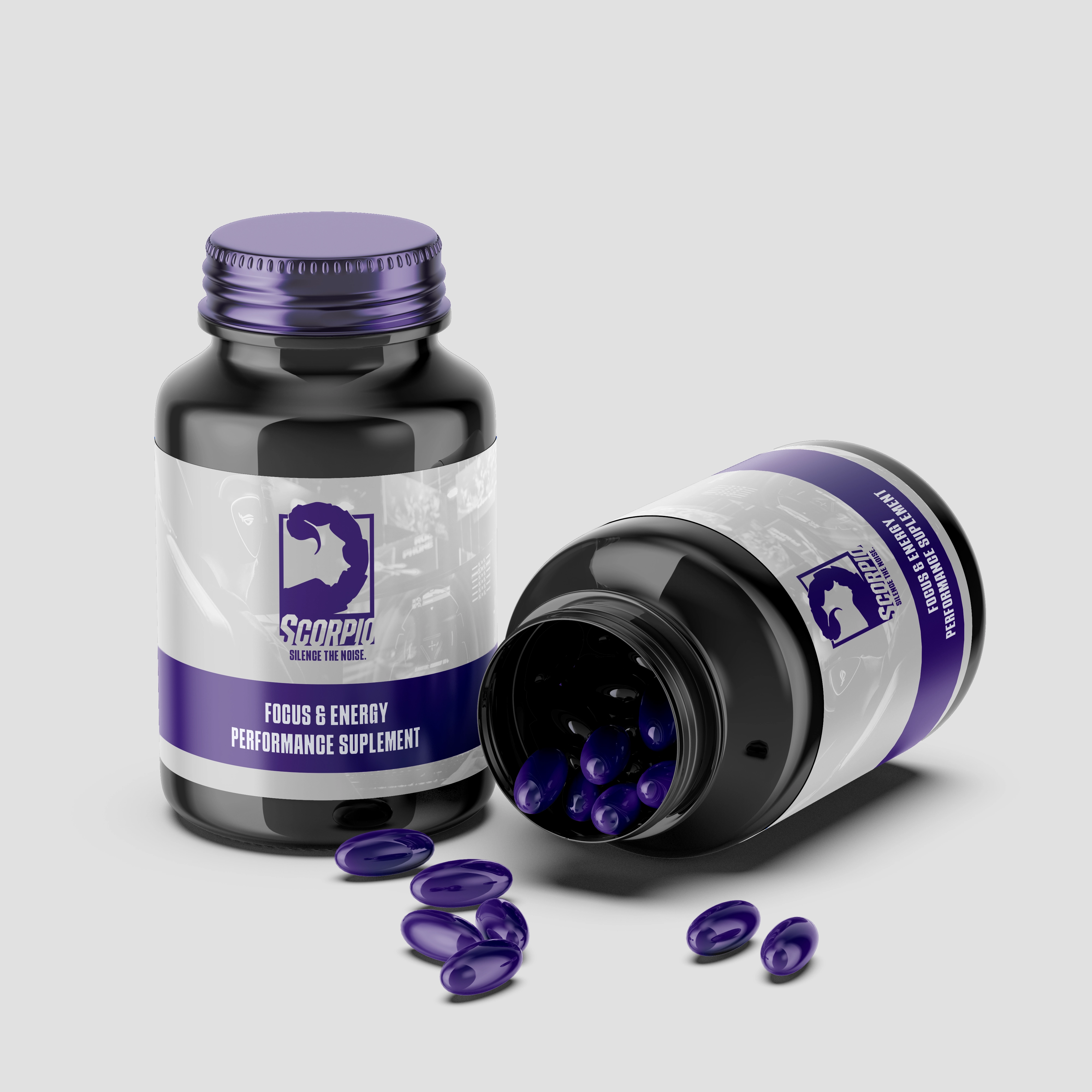
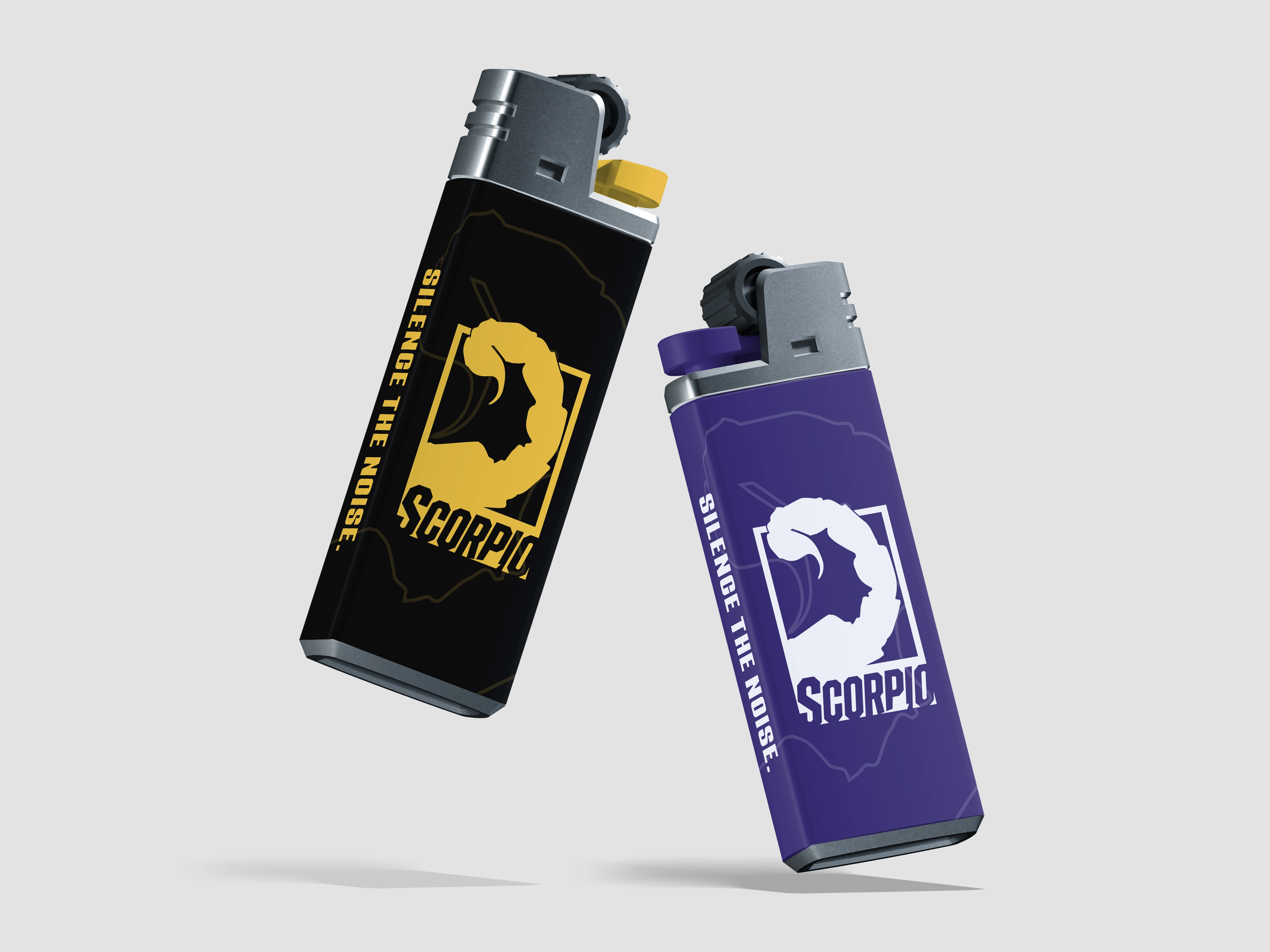
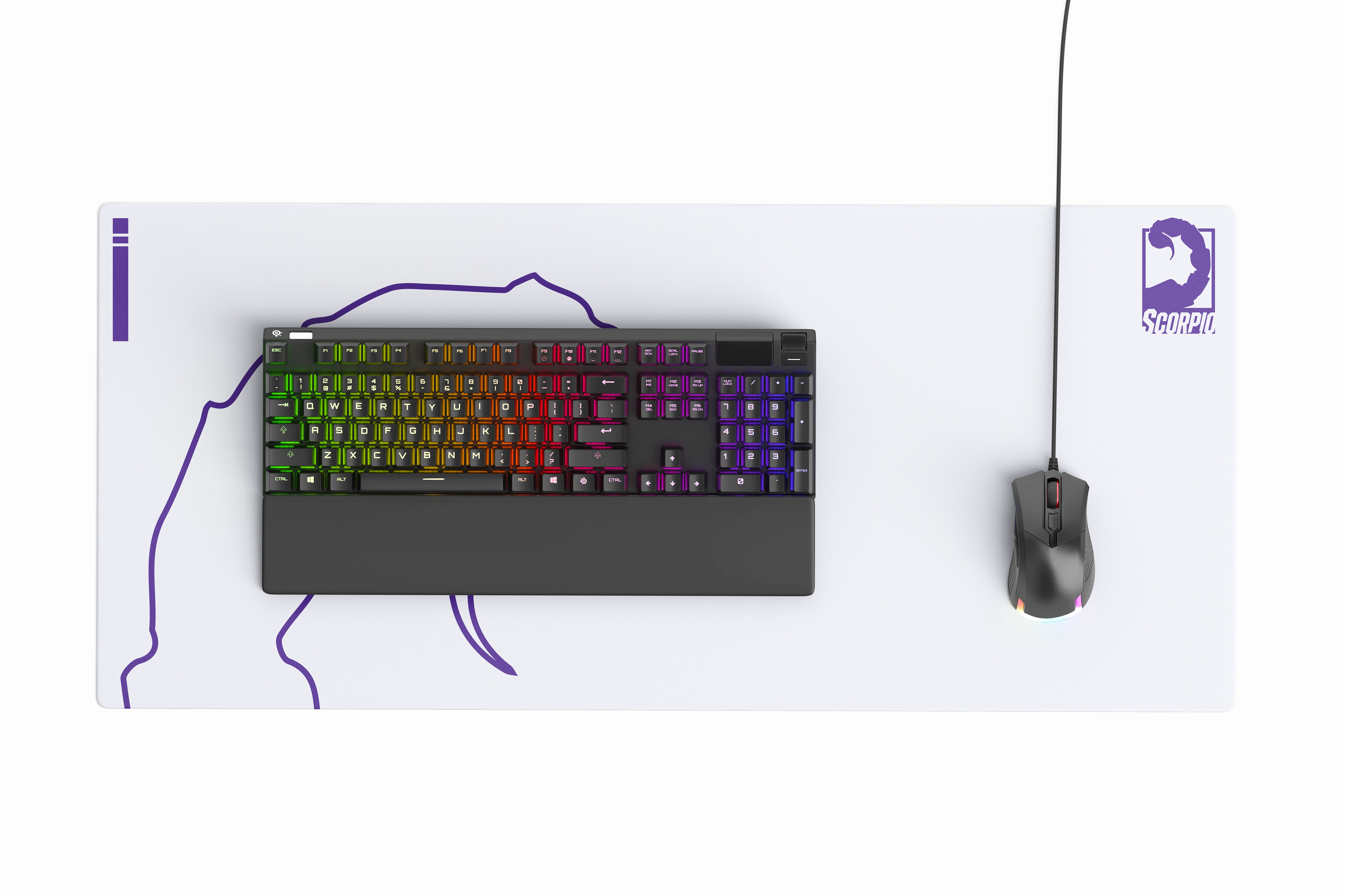
To achieve this, we focused on developing eye-catching packaging and asset mockups. These visual elements not only help to capture attention but also convey a cohesive brand identity that resonates with the target audience, effectively bridging the gap between ambition and reality.
The results
Scorpio’s fresh visual identity establishes the brand in way that makes feel like like it already exist on shelves, ready for purchase and consumption.
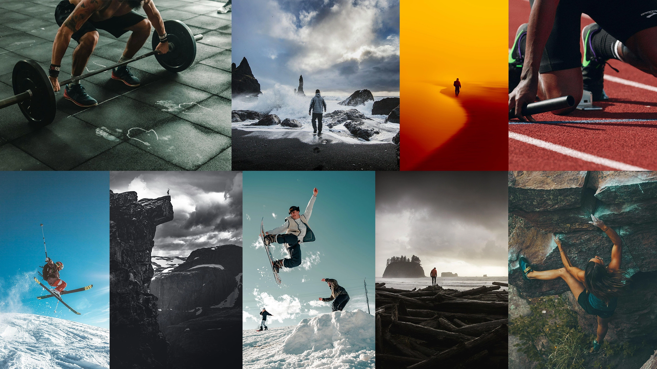
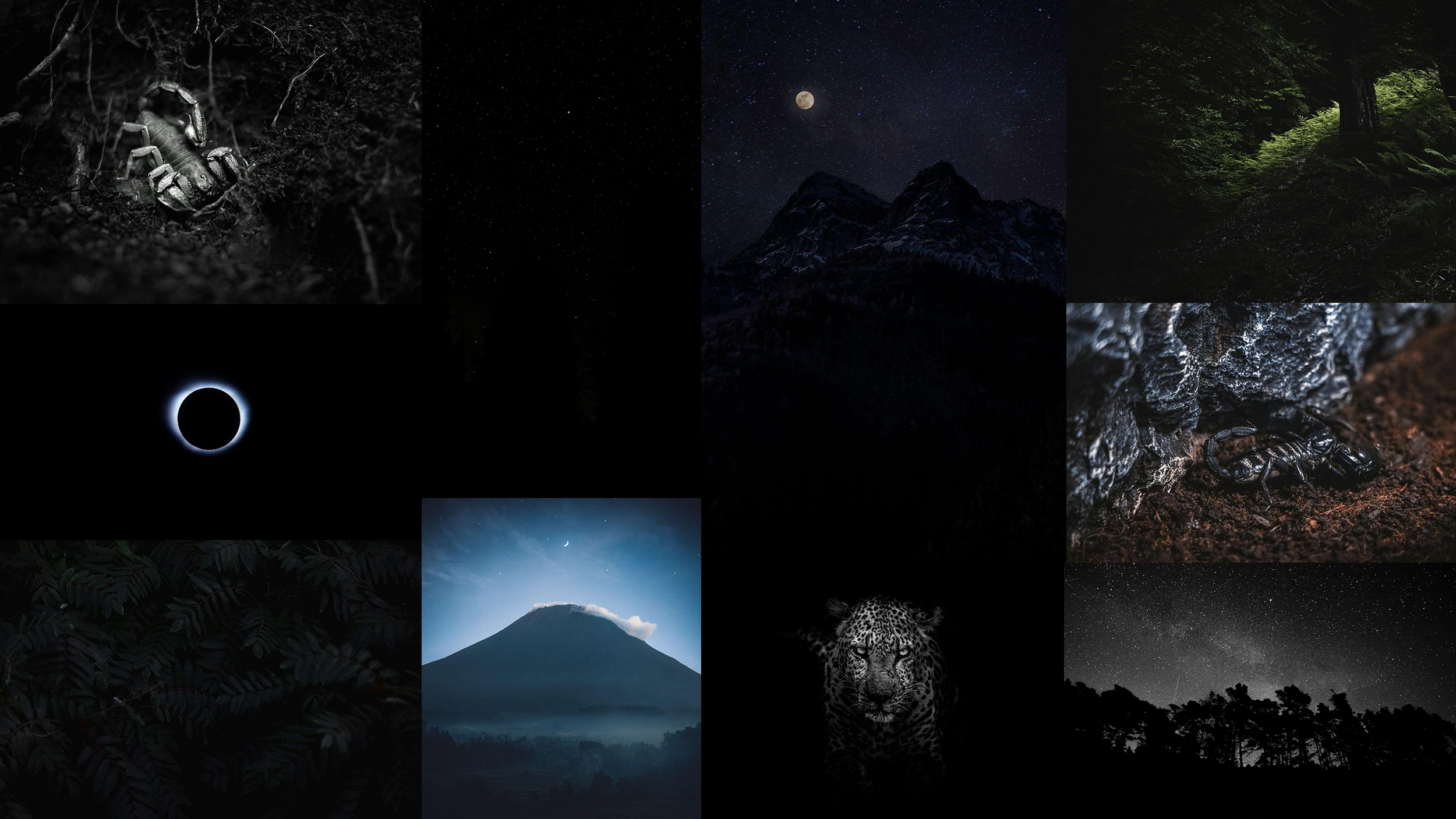
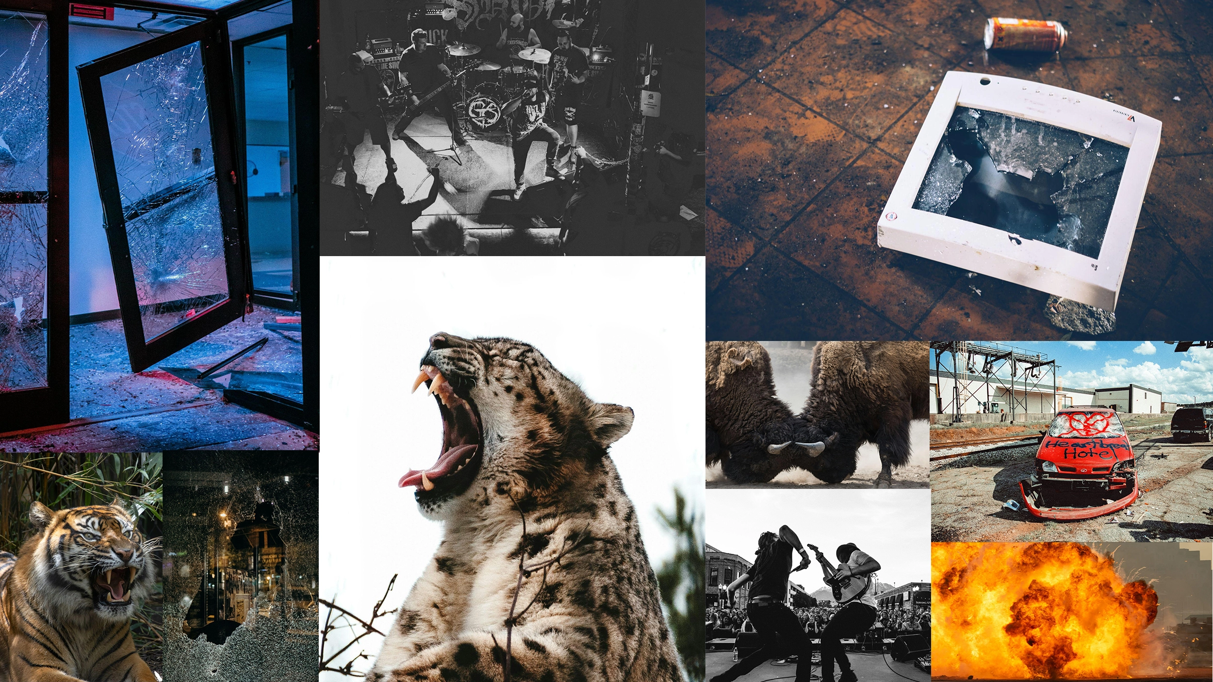
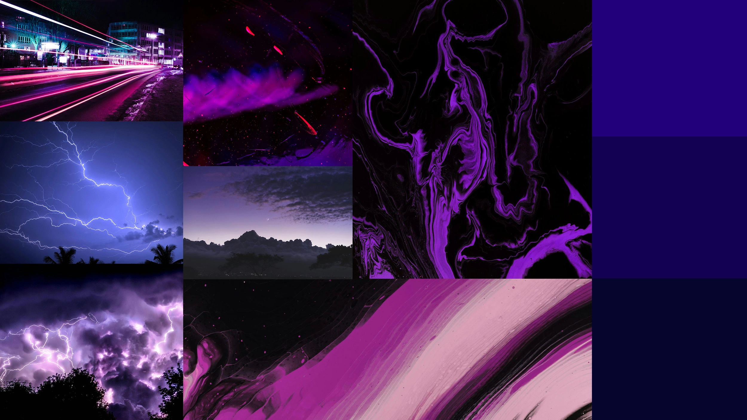
Moodboards
We opted to work through multiple moodboards during this process, giving each action word the space to breath.
The winner
The final logo design effectively captures a sense of quality and superiority, while also embracing the dynamic and high-energy aesthetic typically associated with energy drinks. The bold footprint and sharp lines contribute to an aggressive yet elite look. This balanced approach ensures that the logo stands out in a competitive market, conveying not just an energetic lifestyle but also a commitment to performance excellence.
Typography
Scorpio’s type system uses Schabo Condensed as it’s header type. It’s bold, heavy, commands a sense of strength. It is complimented by Minion Variable, a sans serif typeface with a less intrusive footprint.
Color Palette
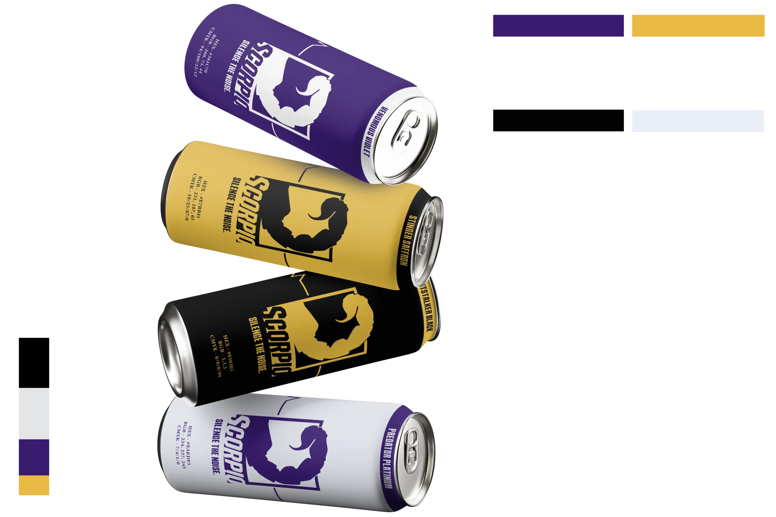
Venomous Violet is the primary color that leads Scorpio’s visual Identity. In a market saturated with reds, blues, and greens, Venous Violet immediately grabs attention in a different way, giving a sense of premium quality.
Stinger Saffron follows closely as the secondary brand color. It’s much more vibrant, reinviting that energy while balancing out the overall aesthetic.
